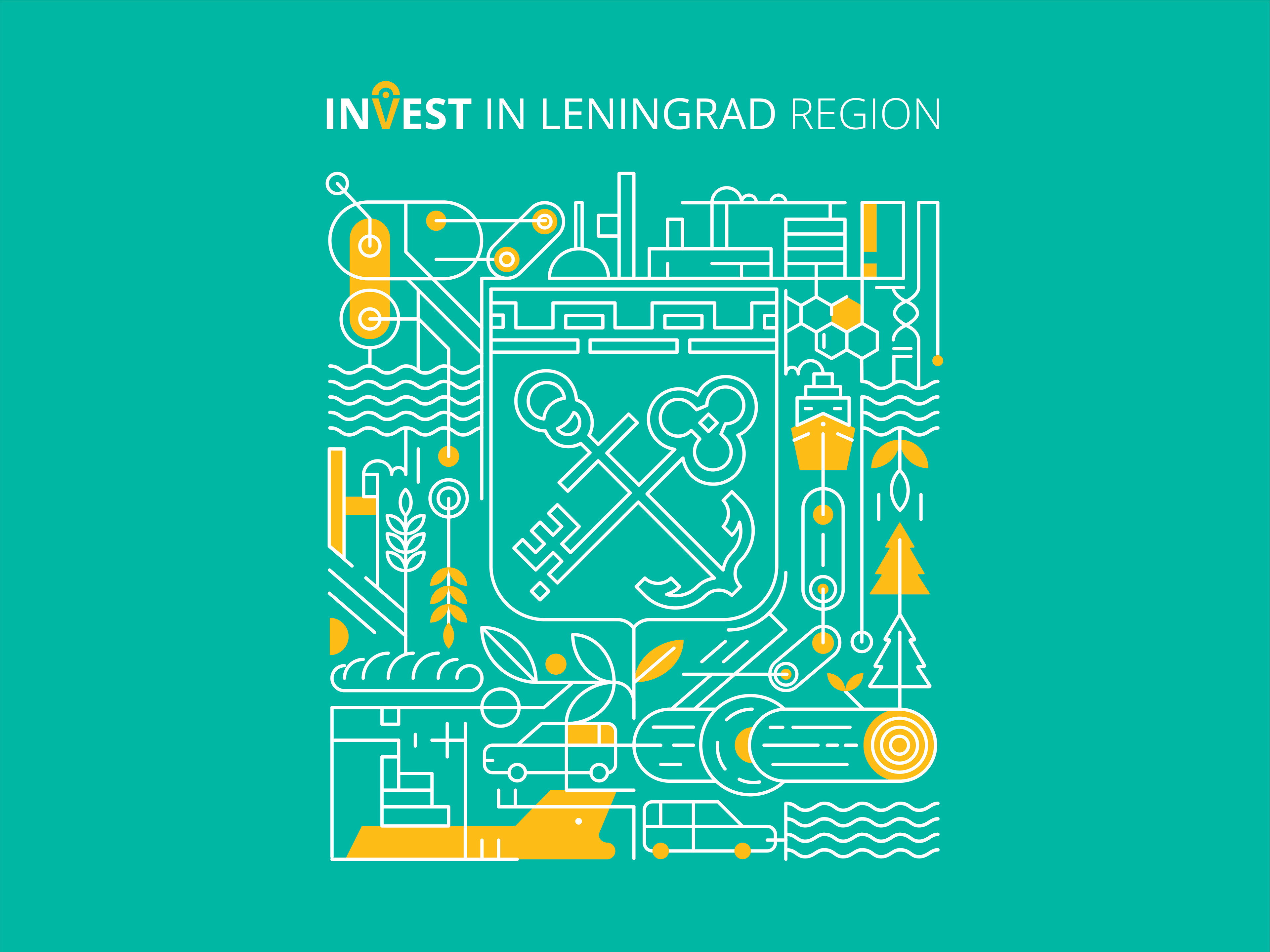
Project: corporate identity elements for Leningrad region.
Result: everything that characterizes the industrial image of Leningrad region is intertwined in the pattern: wood and chemical industry, factories, mechanisms, transportation and, of course, the coat of arms of Leningrad region which is the centre of all these elements.
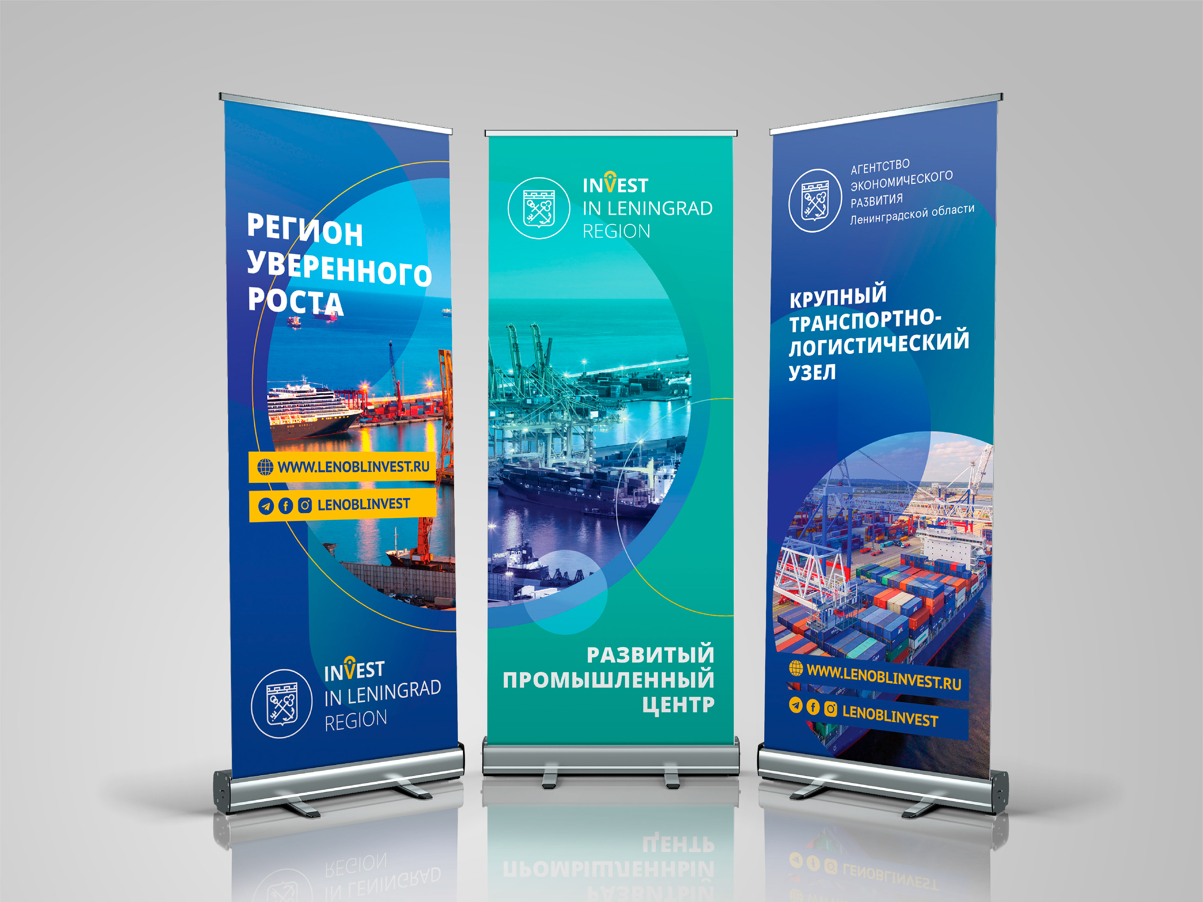
Roll up banners demonstrate that the visual style of the Agency was significantly updated. The previous old-fashioned angular design was transformed into more open and friendly one – a circle became another important style forming element, gradients and photo overlay effects help to create a modern image for the government institution that often suffers from the prejudices of potential investors.